April 23, 2026
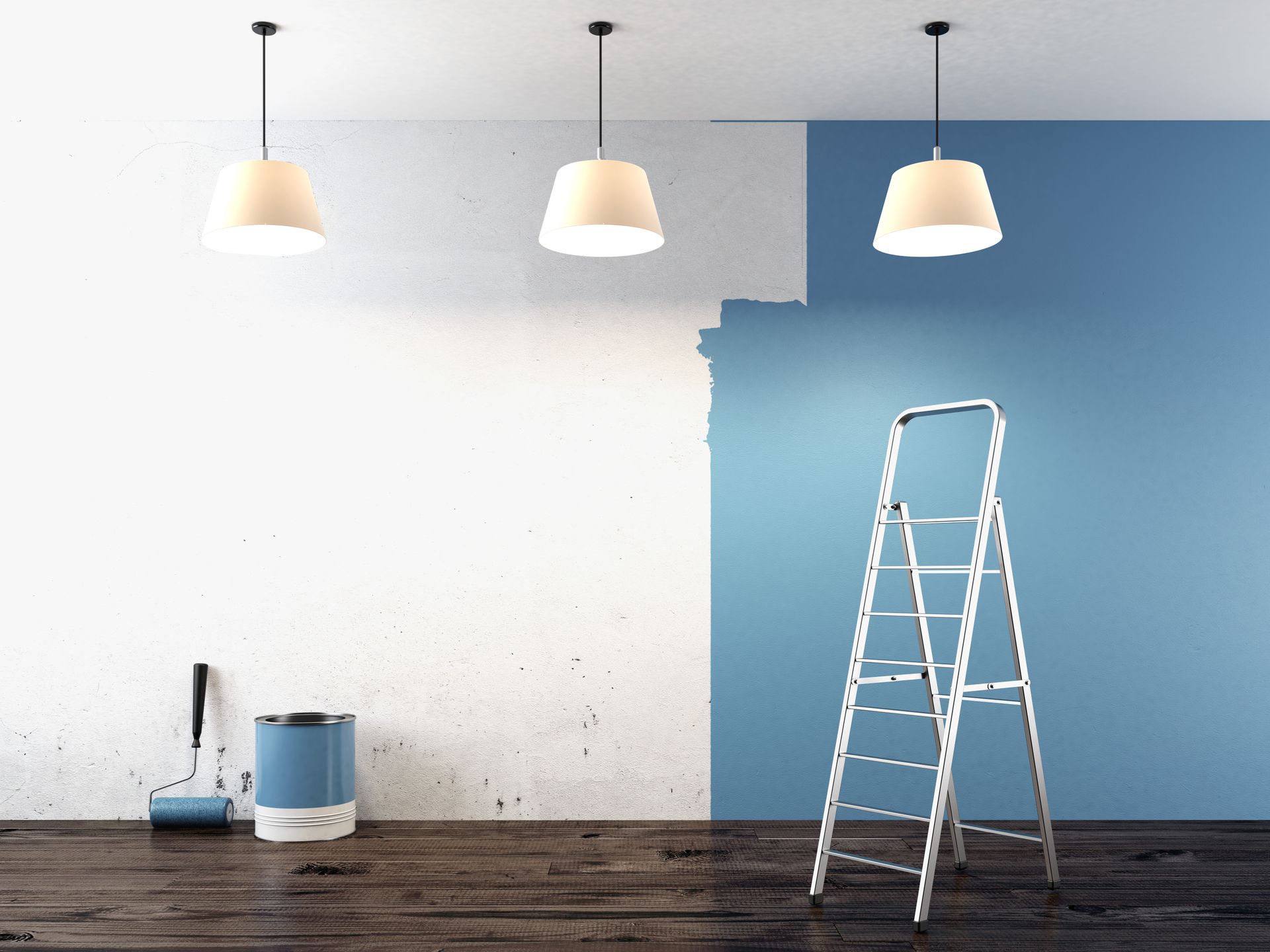
Commercial painting shapes how modern business spaces look, feel, and function. From bold design statements to subtle, refined finishes, today’s trends go beyond aesthetics to support branding, productivity, and customer engagement. Visual presentation carries significant weight in how a space is perceived, and according to Colorlib, about 93% of consumers place the greatest emphasis on appearance when making purchasing decisions. This makes thoughtful paint choices a critical investment. By exploring current commercial painting trends with a commercial painting company, businesses can create environments that not only stand out visually but also align with their goals and audience expectations. Ultimately, staying informed on these evolving trends allows businesses to make confident design decisions that leave a strong and lasting impression.
Applying Foundational Color Psychology Principles
Color psychology examines how different hues influence human behavior and perceptions. An experienced commercial painting company recognizes that leveraging the right colors can significantly affect how a space is perceived and utilized. The basic principles stem from the psychological effects that colors impart, where warm hues such as red and yellow evoke energy and action, while cooler shades like blue and green promote calmness and serenity. Understanding these can help businesses choose colors that align with the emotions they wish to evoke. From vibrant reds in fast-food chains to serene blues in spas, the basic tenets of color psychology direct these decisions.
Color choice is integral to setting the ambiance and atmosphere in a commercial environment. Businesses often look to this science to create spaces that align with their branding and operational needs. For instance, healthcare facilities may opt for calming colors to enhance patient comfort, whereas creative industries might choose more vibrant palettes to stimulate innovation. The selected colors must harmonize with the industry and target audience. Furthermore, a thoughtful color selection can also reflect a company's values and mission.
Enhancing Employee Productivity and Well-being
The colors in a work environment can greatly influence employee productivity and well-being. Energizing hues can boost motivation and efficiency, particularly in environments where quick thinking and dynamic interactions are required. Conversely, overly intense colors may cause stress and reduce productivity. Thus, a balance between energizing and soothing colors can create a harmonious work environment. When used effectively, colors can enhance concentration, reduce errors, and improve employee satisfaction.
The choice of color complements the architectural and interior design, contributing to a cohesive atmosphere that supports work processes. For instance, soft greens and blues are often used in office spaces as they are known to reduce stress and increase focus. Furthermore, incorporating company brand colors subtly can promote team spirit and connection to organizational goals. Selecting the right color palette requires collaboration with designers who understand the nuances of color psychology. Supporting this with research and empirical data can lead to transformative outcomes for workplace environments.
Shaping Customer Behavior and Perception
A professional commercial painting company understands that color plays a critical role in shaping customer perceptions and influencing behavior in commercial spaces. It determines how customers feel when they enter an environment, directly impacting their engagement and purchasing decisions. Retail environments use color to create an atmosphere that drives sales; for example, warm colors may encourage impulse buying, while cool colors can create a relaxed shopping experience. Restaurants may use color to influence appetite, with reds and yellows commonly associated with increased hunger. A strategic application of color can enhance customer experience and affirm brand identity.
The visually appealing atmosphere created through color choices can leave a lasting impression on customers. This impression is critical for brand perception and loyalty. Colors that align with a brand's message can enhance its visibility and create an emotional connection. Additionally, brands that maintain consistency in their color use across various touchpoints, including physical locations, advertising, and digital platforms establish a strong and recognizable identity. Ensuring consistency requires a deep understanding of how colors operate within different contexts and environments.
Embracing Bold and Unexpected Color Combinations
Bold and unexpected color combinations are making significant waves in modern commercial design. These daring palettes push boundaries, injecting vitality and personality into business spaces. By exploring contrasting colors with a reliable commercial painting company, businesses can create eye-catching and unforgettable environments. Such spaces capture attention, leaving lasting impressions on visitors and staff alike. Moreover, these designs reflect modernity and an adventurous spirit, appealing to progressive and innovative brands.
This trend is particularly prominent in retail and hospitality environments, where visual statement plays a critical role. Businesses deploying bold color schemes inspire creativity and energy, setting the stage for memorable customer experiences. Surprising color combinations can invigorate otherwise dull spaces, turning them into vibrant hubs. As consumers seek personalized and unique environments, adopting audacious color schemes becomes a strategic advantage. This adventurous approach aligns with the growing demand for memorable retail and hospitality offerings.
Adopting Minimalist Approaches with Neutral Shades
Contrasting the bold color trend, minimalist design featuring neutral shades continues to dominate modern commercial aesthetics. This approach emphasizes simplicity, using whites, grays, and blacks to create understated elegance. Neutral tones convey timelessness and sophistication, appealing to businesses seeking a clean, polished look. By minimizing visual clutter, monochrome palettes highlight architectural strengths and direct attention to key design elements. The minimalist aesthetic resonates particularly well with luxury brands and corporate environments.
Neutral designs offer versatility and adaptability, accommodating frequent updates and changing trends. Simple, clean aesthetics provide an ideal backdrop for art, branding, and versatile furnishings. This flexibility supports functional spaces that can host various activities without requiring frequent redesigns. Moreover, minimalism communicates professionalism and attention to detail, qualities valued by discerning consumers and clients. The restrained use of color emphasizes quality and craftsmanship, underscoring elegance through simplicity.
Integrating Unique Patterns and Textures
The integration of patterns and textures in commercial spaces marks an innovative shift toward more dynamic and engaging environments. Patterned walls, floors, or accents break the monotony, adding visual interest without overwhelming the viewer. Textures, whether through paint applications or materials chosen for fixtures and furnishings, add depth and dimension to designs. Combining these elements with color enhances the overall sensory experience, creating inviting and tactile spaces. Patterns and textures can serve both aesthetic and functional roles, enhancing neatness and unity in aesthetic planning.
In the retail sector, patterns transform spaces, imparting identity and storytelling capabilities to each venue or area. Textures further influence perceptions, affecting customer comfort and engagement. For instance, a tactile wall texture can invite touching and interaction, enhancing experiential retail designs. In professional settings, refined patterns may reflect stability and tradition, while in creative spaces, they showcase innovation and distinct character. A reputable commercial painting company will understand that designing with patterns and textures requires strategic alignment with brand objectives to ensure cohesive messaging.
As commercial design continues to evolve, painting trends offer businesses new ways to enhance both form and function. Whether incorporating bold color combinations, embracing minimalist neutrals, or adding depth through textures and patterns, each approach contributes to a more engaging and purposeful environment. These trends are not just about style. They influence how employees perform and how customers interact with a space. By staying current with commercial painting strategies with the help of an expert painting company, businesses can maintain a polished, relevant image while supporting their operational needs. A well-executed painting plan ultimately helps create spaces that feel intentional, memorable, and aligned with modern expectations. For a commercial painting company that can elevate your business, contact Mr. Paint LLC today!